iOS Notification Center Redesign
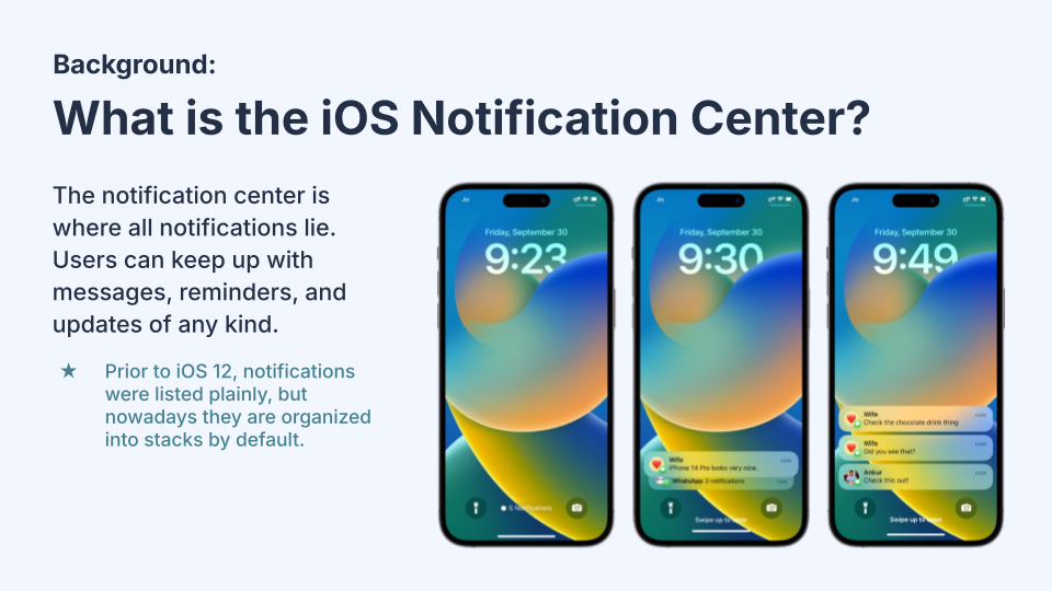
In this final group project for a Design of Everyday Things course at UCSD, my group observed and interviewed users of the iPhone notification center to identify the root causes of problems, analyze the data, and propose a redesign that included Figma prototypes.
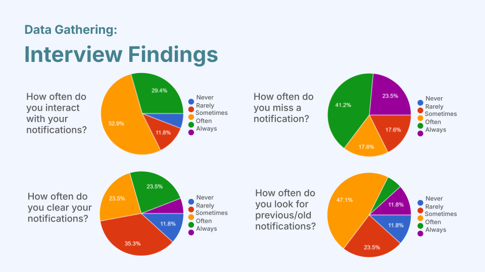
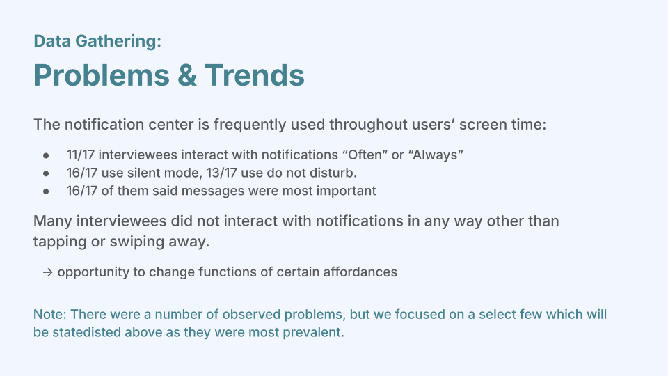
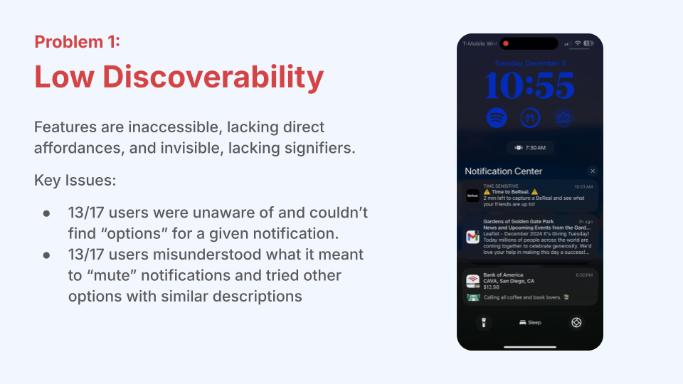
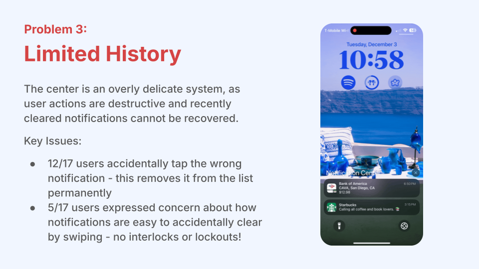
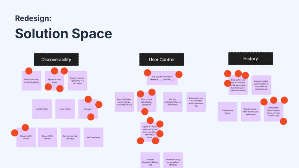
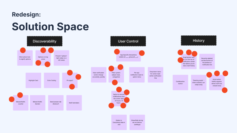
After numerous interviews with users, observations, and users’ tasks, we identified 3 main problems to address to improve the discoverability, user control, and history functionality of the iOS notification center. First, there was the issue of low discoverability; features are inaccessible, lacking direct affordances, and invisible, lacking signifiers. Second, there was a lack of user control. The center has insufficient affordances for how notifications behave, and most options lie only in the settings app. Finally, there is the issue of limited history. The center is an overly delicate system, as user actions are destructive, and recently cleared notifications cannot be recovered. Next, we came up with numerous solutions to address the identified problems. Our redesign solutions consisted of the following:
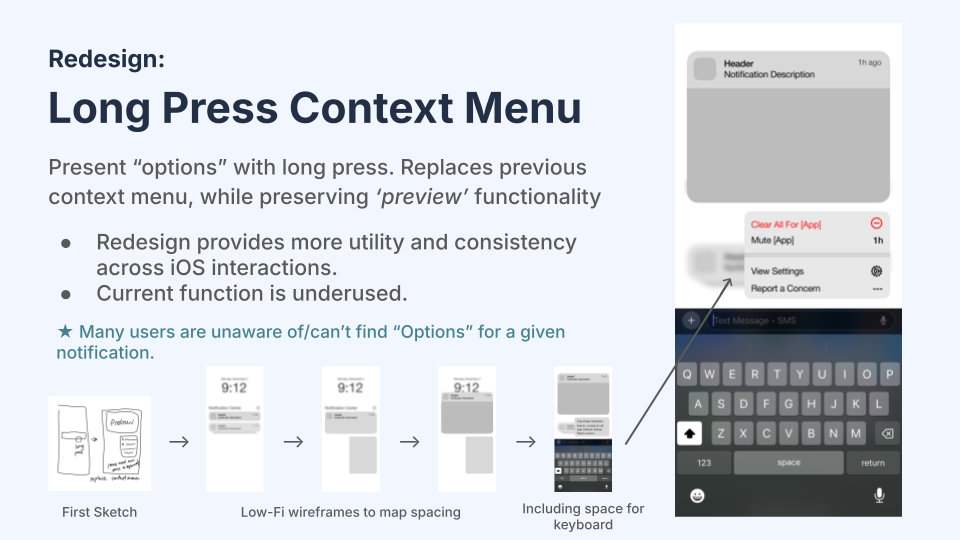
Long-Press Context Menu
Present “options” with long press. Replaces the previous context menu, while preserving ‘preview’ functionality. Redesign provides more utility and consistency across iOS interactions. The current function is underused. ★ Many users are unaware of/can’t find “Options” for a given notification.
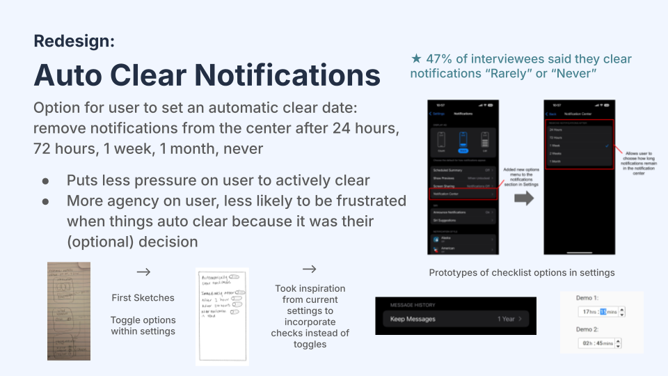
Auto Clear Notifications
Option for user to set an automatic clear date: remove notifications from the center after 24 hours, 72 hours, 1 week, 1 month, or never. Puts less pressure on the user to actively clear. More agency for the user, less likely to be frustrated when things auto-clear because it was their (optional) decision.
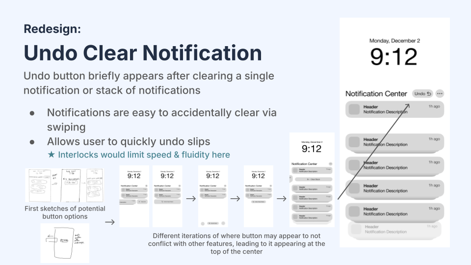
Undo Clear Notification
The Undo button briefly appears after clearing a single notification or a stack of notifications. Notifications are easy to accidentally clear via swiping, which allows users to quickly reverse slips. ★ Interlocks would limit speed & fluidity here
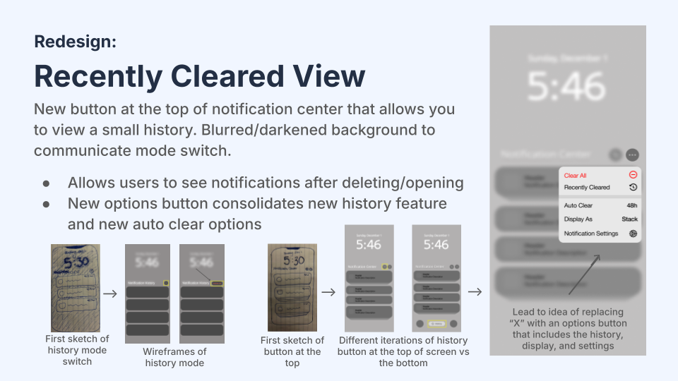
Recently Cleared View
A New button at the top of the notification center allows you to view a small history. Blurred/darkened background to communicate mode switch. Allows users to see notifications after deleting/opening. The new "options" button consolidates the recently deleted feature and the new auto-clear options
Through this project, we learned firsthand how the double diamond process is more than 2 diamonds - to make a good product, you have to build, test, and repeat!